Notice: Function _load_textdomain_just_in_time was called incorrectly. Translation loading for the hostinger-ai-assistant domain was triggered too early. This is usually an indicator for some code in the plugin or theme running too early. Translations should be loaded at the init action or later. Please see Debugging in WordPress for more information. (This message was added in version 6.7.0.) in /home/irttsubu/webartinfo.com/wp-includes/functions.php on line 6260
Harnaaz – Page 2 – Webartinfo | Creativity With Perfection
Notice: Function WP_Scripts::add was called incorrectly. The script with the handle "czgb-block-frontend-js" was enqueued with dependencies that are not registered: slick-carousel. Please see Debugging in WordPress for more information. (This message was added in version 6.9.1.) in /home/irttsubu/webartinfo.com/wp-includes/functions.php on line 6260
Posted on — Leave a comment

Web development on Chrome OS

Web development on Chrome OS

This talk demonstrates how in a few clicks you can get a full web development environment up and running on Chrome OS, including how to do cross-browser testing! 🙂

Transcript

Hi. I’m Emilie Roberts, a developer advocate with Chrome OS developer relations. Today, I’m going to talk about web development on Chromebooks. Here is a quote from you, a skilled web developer. “Chromebooks are awesome.” And if you don’t remember saying this recently, I hope that after watching this video, it will become a daily thing. Chromebooks are known for being lightweight, fast, secure web browsing machines. They are so much more. The device portfolio has grown to include tablets, detachables, all-in-one, mini desktops, and of course, laptops and convertibles. Many of these are capable development devices. So what can you run on them? Well, IDEs like Visual Studio Code, Atom, WebStorm, tools like Node, React, Docker, and Git, and you can test your web apps with multiple browsers, including real mobile browsers. As well, you can check how your mobile app interacts with your web server, all right on the same device. OK. Let’s get started and get your Chrome OS device ready for development. We are going to set up a Linux environment and then install the tools you need. To start, open Chrome settings and search or scroll down to Linux. Click Turn on. This will download and setup a Linux environment. When it’s complete, you’ll see a terminal prompt. Pro tip– if you will be doing a lot of development, pin the Terminal by right-clicking and choosing Pin. Now we have a Linux environment. Let’s install some tools. Head over to the Visual Studio Code website and download the Linux.deb package. Double-click and choose Install. Once it’s installed, you can find VS Code in your App Launcher. If you’re going to be using this IDE a lot, you can pin it like we did with the Terminal. Any application with a .deb package can be installed in a similar way. Let’s install Atom. The process is exactly the same– download, install, and launch. Not every app has a .deb package, but you can install any of your favorite tools that support Debian Linux. For example, to install Sublime Text, follow the Linux instructions on the website to set up the APT repo and install the editor using the command line. When we install Node in a few seconds, we’ll take a closer look at command line installation. And the same thing goes for apps like WebStorm. Just go to the website, follow the Linux download and install instructions. I won’t do WebStorm right now. Let’s get right on to the server side of things. Oh, and by the way, at the end of this video, I will direct you to a page by the Chrome OS DevRel team with installation instructions for all the apps and more discussed in this video. Now, beyond what I mention today in this video, if your favorite tool is supported in Linux, it should run on Chromebooks. For example, I like gedit for text editing, FileZilla as an FTP client, and Inkscape for vector graphics editing. Today, web development usually takes more than a text editor, an IDE, or an FTP client. Let’s get to some other tools so we can make some really nice web apps. Node.js requires gnupg2. Open up your Terminal and install it with apt. That command is sudo apt install gnupg2. If you’re new to apt, you can probably guess that by replacing gnupg2 with whatever package name you want, it will install that package. Now, finding the right package name can sometimes be the tricky part. Note, as we continue with this video and other terminal commands, I won’t read every line out loud. But as mentioned, I will provide a link at the end that has them all. Now that the dependency is installed, let’s get Node.js. Run this cURL command followed by another apt install command for node. That’s it. Node.js is ready to go. Don’t believe me? Well, let’s try it out with PROXX. Use git to clone the PROXX repo and NPM to install, build, and serve the PROXX web app. Navigate to localhost:8080 in your web browser and check it out. Pretty cool. So much minesweeping to be done. Let’s try React. Using NPM, you can install, create-react-app, then use create-react-app to create a skeleton project. Here, I call it hello-world-react. Navigate into the directory where it was created and call npm start. Now, navigate to localhost:3000 in your browser and check it out. If you prefer Angular, install that, too. The steps are almost the same. Again, we use NPM to install @angular/cli. Create an Angular app using ng new my-angular-project. Change directories into the project folder using cd, for change directory, my-angular-project. Now, in gServ, browse to localhost:4200 and check it out. Here, you’ll notice that I have PROXX, a React app, and an Angular app all running on different ports all on the same Chromebook. I think this is pretty handy. What’s more, this is all local, so as long as your tools are already installed, you could do all of your development offline– say, like on a plane. What about Docker? No problem. Again, we’re going to follow the normal Linux installation steps. First, we double-check that all the dependencies are installed. We add the Docker repository to apt, and then we update the apt package list since we just added a new repository. We use sudo apt update to do this. Then install Docker. Test it out by running hello-world. This is done with sudo docker run hello-world. You should get a nice message showing that everything is working. Let’s do something a little bit more advanced by running an Ubuntu Linux container in Docker. sudo docker run -it ubuntu bash. And there you go. Your output is going to look something like this. In the Ubuntu container, I’ve taken a look at the OS version with cat /etc/os-version and you can see, it’s really Ubuntu. Now, once an app is ready to deploy, it should be tested. Because Chromebooks have web, Android, and Linux, you can test across multiple browsers on multiple platforms all right on the same device. Let’s install a whole pile of browsers to prove this point. Using the Terminal and apt, install Firefox for Linux. Note in Debian, the package name is firefox-esr. Then let’s also install the Chromium browser for Linux. Feeling brave? Let’s install the Brave browser for Linux. I won’t walk through all of these lines right now, but again, they are just the standard installation instructions for Debian Linux. We install the GPG key, we install the repo, and finally Brave. Now, if four browsers aren’t enough, let’s add a few more. Head over to the Google Play Store and install some Android browsers. Let’s go with Firefox for Android, Opera for Android, and Chrome Beta for Android. We now have seven browsers installed, which can give us a reasonable first attempt at test coverage. We have the Chrome OS Chrome browser, three Android browsers– that is Firefox, Chrome Beta, and Opera– three Linux browsers– Firefox for Linux, Brave, and Chromium. And here you can see that our PROXX web app is running on all seven. One last thing to mention. In case you have a mobile app that interacts with your web service, you can do Android, TWA, and Flutter development on Chrome OS devices, which means you can build and package your mobile app on your Chromebook, test it right on the device you are coding on, like any other Android app, build your web component, start your web server, and then test everything on multiple browsers and see how it interacts right on the device. Android Studio is as easy to install as Visual Studio Code or Atom. Head over to the Android Studio site and download the .deb file. Then, you can code your app like you’d expect in Android Studio with one cool difference. You’ll notice that you can push directly to the Chromebook you’re working on. Pretty cool. Full instructions on how to set this up can be found on the link at the end of this video on the Android page. So with your Chromebook, you can build web apps with the tools you are used to, develop and test right on device with tools like Node.js, Docker, and Angular, test across multiple browsers, including mobile browsers, and even test mobile app and web interaction right on device. And all of this could even happen offline, like on a long flight. So now, don’t you agree Chromebooks are awesome? As promised, here is a link to a guide to get your Linux environment customized just the way you like. It’s cros.page.link/web-dev. Thank you. Can’t wait to see what you build.

Posted on — Leave a comment

Best Black Friday deals for web developers and designers

Askbootstrap

With the bulk number of Black Friday deals available online, one wishing to grab the best deals is most likely to be lost. But if you are a web developer or a designer, you’ve just landed on the right place to win this year’s Black Friday season. We’ve curated some of the most amazing deals that you can grab without even thinking twice.

As a web developer or designer, we presume you might be making either your own website or your clients’. Whatever the part of web development you are involved in, we do have deals that suit your needs. So, let’s check them out.

Best Black Friday deals for web developers and designers

[divider style=”solid” top=”20″ bottom=”20″]

Askbootstrap (Themeforest)

Enjoy 70% Black Friday discount on all items in Themeforest Profile.

Coupon code: No coupon code required

Sale ends on: December 1, 2019.

[button color=”red” size=”medium” link=”https://themeforest.net/user/askbootstrap/portfolio” icon=”” target=”true” nofollow=”false”]Grab the Deal[/button]

[divider style=”solid” top=”20″ bottom=”20″]

Askbootstrap (Website) Premium & Free Templates

Enjoy 70% Black Friday discount on all items in Askbootstrap premium templates.

Coupon code: No coupon code required

Sale ends on: December 10, 2019.

[button color=”red” size=”medium” link=”https://webartinfo.com/shop/” icon=”” target=”true” nofollow=”false”]Grab the Deal[/button]

[divider style=”solid” top=”20″ bottom=”20″]

Askbootstrap (Templatemonster)

Enjoy 50% Black Friday discount on all items in Templatemonster Profile.

Coupon code: No coupon code required

Sale ends on: December 1, 2019.

[button color=”red” size=”medium” link=”https://www.templatemonster.com/website-templates/bookishow-movies-events-sports-website-template-87181.html” icon=”” target=”true” nofollow=”false”]Grab the Deal[/button]

[divider style=”solid” top=”20″ bottom=”20″]

We went through a lot of Black Friday offers and picked the above ones for you. If you are a web developer or designer looking for such sales, grab the deals you like. Good luck! 🙂


Posted on — Leave a comment

Motion Design in UI – Designing in the Browser

Welcome to “Designing in the Browser.” In this series, we explore how to take a design, build it, and then tweak it in the web browser using the latest in web technology and design systems. Today we’re going to take a look at how we breathe life into our user interfaces using animations and interactions, and how we can scale motion principles throughout our application. Let’s dive in.

Motion on the web is a key part of any user experience. We need to be able to give a user feedback when they explore a page, whether that be via hover, focus, click, touch, or swipe. We can even provide interactions in response to user actions, like adding an item to a shopping cart. Simple interactions can be transitions between two states. Animation on the web, a similar but distinct concept, brings the user’s attention to a particular place in the UI, and can bring to light an otherwise standard web experience. It’s especially important that we have motion on the web, because a website is a digital interface that lacks real world cues, like physical touch and 3D space. These cues are what help us to understand the context of our daily experiences. However, we can imitate the physical world to create context in the web through motion principles in our UIs.

Material Design, Google’s open source UI design system, breaks motion down into three principles– informative, focused, and expressive.

Motion is informative – Motion shows spatial and hierarchical relationships between elements, which actions are available, and what will happen if an action is taken.

Focused – motion focuses attention on what’s important without creating unnecessary distraction.

Expressive – motion celebrates moments in user journeys, adds character to common interactions, and expresses a brand’s personality and style. Let’s take a look at some of these examples of motion within a UI.

We’ll start with transitions. Transitions allow for properties to change from one value to another. You can adjust the speed, timing function, as well as specify which properties are actually getting transitioned.

When you transition a property in CSS, the browser interpolates between values, meaning it calculates the steps between the starting and ending point, and displays those steps based on the speed and timing functions in between. A transition can be as simple as a color shift on hover.

I have a box here, and on hover, I’m simply changing the background color to be yellow. You can see this in DevTools by clicking on the element state here and selecting Hover. I’m also applying this to focus. You can see here that, even though the focus state is in a light gray, meaning it’s not currently active, the focus state is also getting the same style as the box on hover. You can test focus state as well with these element state tools. It’s a really nice way to test transitions on the web.

Here is an example of a material design component button. There is also a transition here when you hover over it. It is a little bit more subtle. There is a shadow that comes out of that, giving a little bit of depth to this button. But the simple transition here is that this box shadow is expanding.

So if we take a look at that, what it looks like is this. You have your box shadow, which is a little bit more of a complex transition here. And we’re specifying the transition to state what property we’re transitioning, the box shadow, the speed of the transition, 280 milliseconds, and then a cubic bezier as the timing function for the transition. When you hover over that button or focus on that button state, the box shadow changes to be a little bit more separated from the button to give it that appearance of popping off the page. This allows for a fluid transition that gives you some kind of 3D context based within physical space.

You can have multiple properties transition on any given element. And if the syntax can be calculated by the browser, like color, sizing, opacity, and transform, it’ll be a smooth transition. Some properties, like blend modes, can’t transition, because there are no values to calculate between those two states. So keep that in mind.

For the best performance, stick to transitioning opacity and CSS transforms so you don’t have to go through the entire paint, composite, layout steps when you’re applying changes in your CSS.

In this episode, I’ll be focusing on CSS-based animations. But if you’re interested in the topic of web animations in general, note that the Web Animations API provides much more power. The Web Animations API gives us key framing and timelines, meaning that we can start, stop, pause, and reverse animations, as well as orchestrate motions to start after one has ended.

CSS animations use the @keyframe keyword, and can also get pretty complex. You can use step or percentage animations to animate multiple properties at a time. Step animations aren’t necessarily fluid, think the second hand on a ticking clock. But with UI animations, we most often see percentage-based animations.

I’ll show you an example. So in this example, I’m using Glitch.com to be able to showcase the code next to the visualization of this animation. I have this ringing button, and there’s two different animations happening at the same time. There is a ring, where this icon is translating from left to right and sort of shaking. And there’s also a growing animation, where it’s scaling up. It’s also changing its container color. We’re using a couple of mix-ins here to change that container color. So we’re orchestrating both of these animations, and on the web we’re applying this animation grow onto the button itself. And then onto the icon specifically, we’re using the ring animation. So you can really make these complex. Here I’m using decimal points within a second. So you don’t just have to use percentage based on the second hand. You can really get complex here and make it as detailed as you want. Don’t think that CSS animations have to be simple. You can orchestrate them too. You just have to be careful with timing it yourself.

This example is a bit complex, but you can also have much simpler animations, and those are pretty common on the web. One shortcut I often use for animations is using the from and to keywords to stand in for 0% and 100%. That’s a pretty common thing when you want multiple properties to maybe transition at the same time, and just want to quickly throw them up in an @keyframe statement.

But what do these techniques look like within the frame of our motion principles? Let’s start with the first principle– motion is informative. We can use motion to create connections between elements and actions. The material design ripple is a great example of this, and I’ll show you what that looks like.

So here we have a layout. This is the material theme builder, where you can adjust properties like shape, color, and typography, and see what that looks like with all of these different components on a single page. Now, if I click on this button, you’ll see that wherever I click is where the ripple starts, and it then extends to the rest of the element. So it’s a response to the user. It’s this reaction to where the user is clicking on this UI. And that’s really nice, because we are creating this visual digital response mechanism to user input. You’ll also see a ripple in this card example. When you click throughout the card, you see that wherever I press is where the ripple starts and expands throughout that section. But the card is broken up into various sections. There is this main section, which is where we have an image, a headline, some text. That might be a link into a post, for example. We also have this bar here with buttons. Those buttons might represent actions. So we want to be able to separate the place that we click within that card with the action that’s taken by the user. So having that ripple expand and also a different state change, that color change that happens once we click, that helps the user to understand there’s different possible actions within the same element within a UI.

I also love the animation in the material checkboxes. That’s one of Disco’s favorite too. Here’s a demo with a data table. In this data table, we have the checkboxes. And you can see, as I click the checkbox, the little check pops in, it animates, and it’s really nice, the little user experience gives that feedback. We also see that the background of this element changes to a light purple color and this theme. And that indicates that the item is selected, along with the checkbox. When all of these items are selected, this top checkbox will also be checked, because every item inside of that is selected. If we deselected all of those, we see they all animate out the same time. So having this motion really helps to bring the user’s attention here.

Another item that’s important in motion is how it connects various elements. So here, we have a chip, and this chip is a filter chip. When we click the ice cream, the checkbox pops in, not only in that ice cream chip, but also in the items inside the data table. So it creates this really nice uniform interaction inside of this component, even though they’re two different elements that are interacting with each other.

This allows for this idea of a physical space, these physical interactions, these physical connections to be translated onto the web in a way that’s a little bit easier for you and for your users to understand.

The second principle is that motion is focused. It captures a user’s attention. Here are two examples of animations which call to the user’s attention. The first one we just looked at earlier is that ringing button. It brings the user’s attention to a possible action. In a floating action button, users can click to take a single action, or click to expand for a variety of actions. So this ringing floating action button brings attention to itself and asks the user to respond. The ring and grow animations being applied at the same time make this possible. They bring this fab to life.

Here’s an example of a shiny shop button which has a subtle sheen that just goes from left to right across it. And we’re using linear gradients to do this and this skew transformation. So here, we can see that that skew is translating from 0% to 100%. The animation is happening from 0% to 10%, and we’re then pausing. So it’s not repeatedly happening. So it’s going from 0% to 10%, and then we’re waiting till 100% to start over that little sheen across the button. But this also calls to the user’s attention, calls to that action button of adding to cart. And it’s just a little subtle nod to your user to pay attention to a specific place in the UI.

If you want to play with some of these examples, all of the links we’ve provided below for you to check out, remix, make them your own.

And finally, the last principle is that motion is expressive. In the previous example, the ringing button can bring a little personality and fun to an interface while also being informative.

I love these examples from the material.io spec that demonstrate how motion adds character and appeal to interactions. Motion on the web helps users to understand your app. It’s not just for flair and effect, but for a better user experience.

I hope today’s show helped you see how motion can be integrated into your application as something that’s informative, provides focus, and adds brand expression. What are your favorite examples of motion design on the web? Leave a comment below. We’d love to see them. Until next time.

Posted on — Leave a comment

6 Tools to Track Your Instagram Followers

If you are merely a casual user of Instagram, showing a few pictures with your friends, you may not see any need to track your Instagram followers, or indeed how your posts perform. However, if you take your Instagramming more seriously, you are going to want to keep a vigilant eye on your Instagram account, along with the genuineness of your followers.

This is particularly the case for influencers and brands. In both cases, the quality of their following matters very much. Ultimately brands are only in the social space to strike a dialogue with their customers and potential clients. Their work with influencers has the same overall goal. There is little point in having followers who are not part of their target market.

It is perhaps less crucial for non-commercially minded influencers. However, they, too, are unlikely to be influential with people who couldn’t care less about their posts.

Brands and influencers are also interested in the behavior of their followers. What types of posts interest them? Which topics are of little importance and get ignored?  As far as serious influencers are concerned, analytics, and data about their Instagram performance can be a godsend, and help them make more interesting and valued posts.

The following list highlights tools that, in some way, help you track your Instagram followers, and in many cases, the overall performance of your Instagram account.

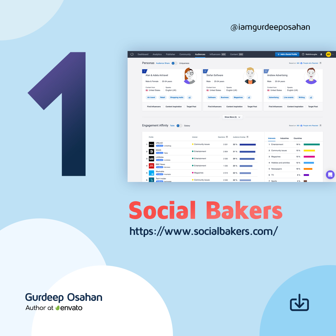
1. Social Bakers

6 Tools to Track Your Instagram Followers

6 Tools to Track Your Instagram FollowersSocial Bakers is primarily a social media management platform that you can use to manage all your marketing tasks together easier. It includes an Analytics & Benchmark section that covers everything from benchmarking, content, and performance to influencers and paid campaigns. You can use it to get the full information you need to understand your performance. It allows you to benchmark your organic, paid, video, and influencer performance metrics against industry averages or competitors.

Although not as advanced as the paid tool, Socialbakers offers a free Instagram Analytics Tool for personal and business profiles. It allows you to discover your most popular Instagram posts, track your success, and learn what gets your audience double-tapping. It shows your most popular photos, filters, and hashtags, although it only offers limited information about your followers.


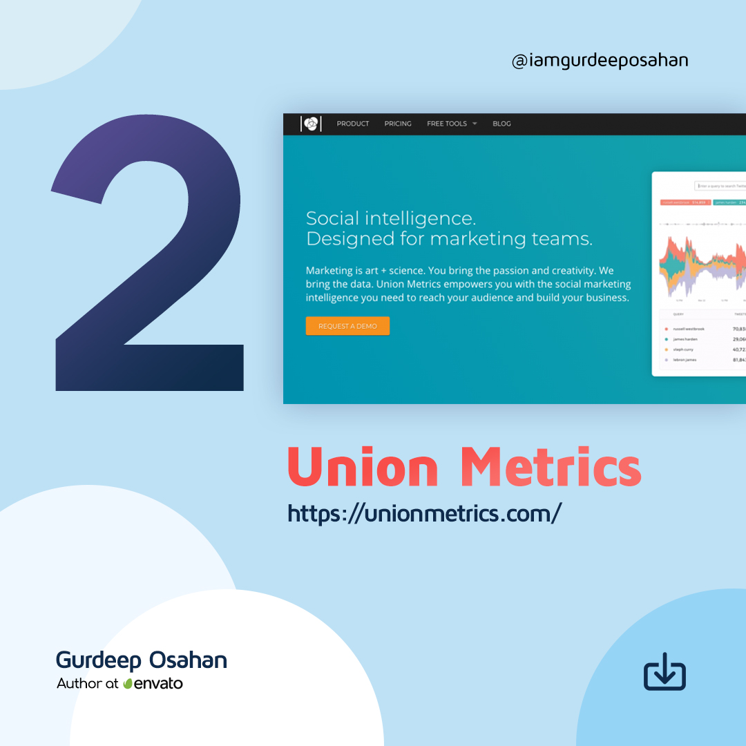
2. Union Metrics

6 Tools to Track Your Instagram Followers

Union Metrics offers a free Instagram account checkup. It is of limited use to understanding your followers over time, although it provides some insights into how your account is performing currently.

The Union Metrics paid plans provide more information to marketers. The $49/mo Social Manager plan allows you to analyze engagement and measure the performance of your social accounts. With the $99/mo Social Marketer plan, you can monitor relevant conversations and generate audience insights with in-depth reporting. At the top end, you have the $199/mo Marketing Team package that offers all the analysis, monitoring, and reporting you need for comprehensive social marketing.

You can use Union Metrics to monitor all your social profiles to learn precisely how your content performs. It will show you what content works across social media – and what doesn’t, and when your audience is most receptive to find the best time to post.


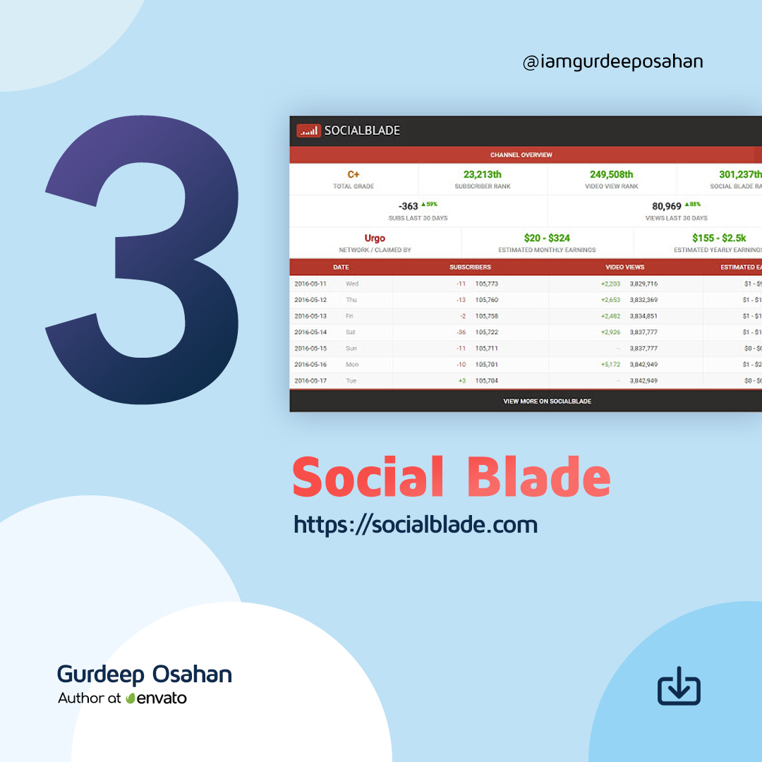
3. Social Blade

6 Tools to Track Your Instagram Followers

Social Blade provides a wealth of stats on public Instagram media accounts. They pull data explicitly from your public profile, so you won’t find anything if you have made your account Private – but if you are a business or influencer, it makes no sense to have a Private account.

For future projections, you do need to provide them with at least two points, so you need to scan your account multiple times over time if you want to build a set of useful data.

Social Blade also shows quite a few interesting charts about the top Instagram accounts, such as the Top 50 (and 100) Followed Instagram Users. They do emphasize that they are using the new Instagram API, so they can only get data on Instagram business/creator accounts.


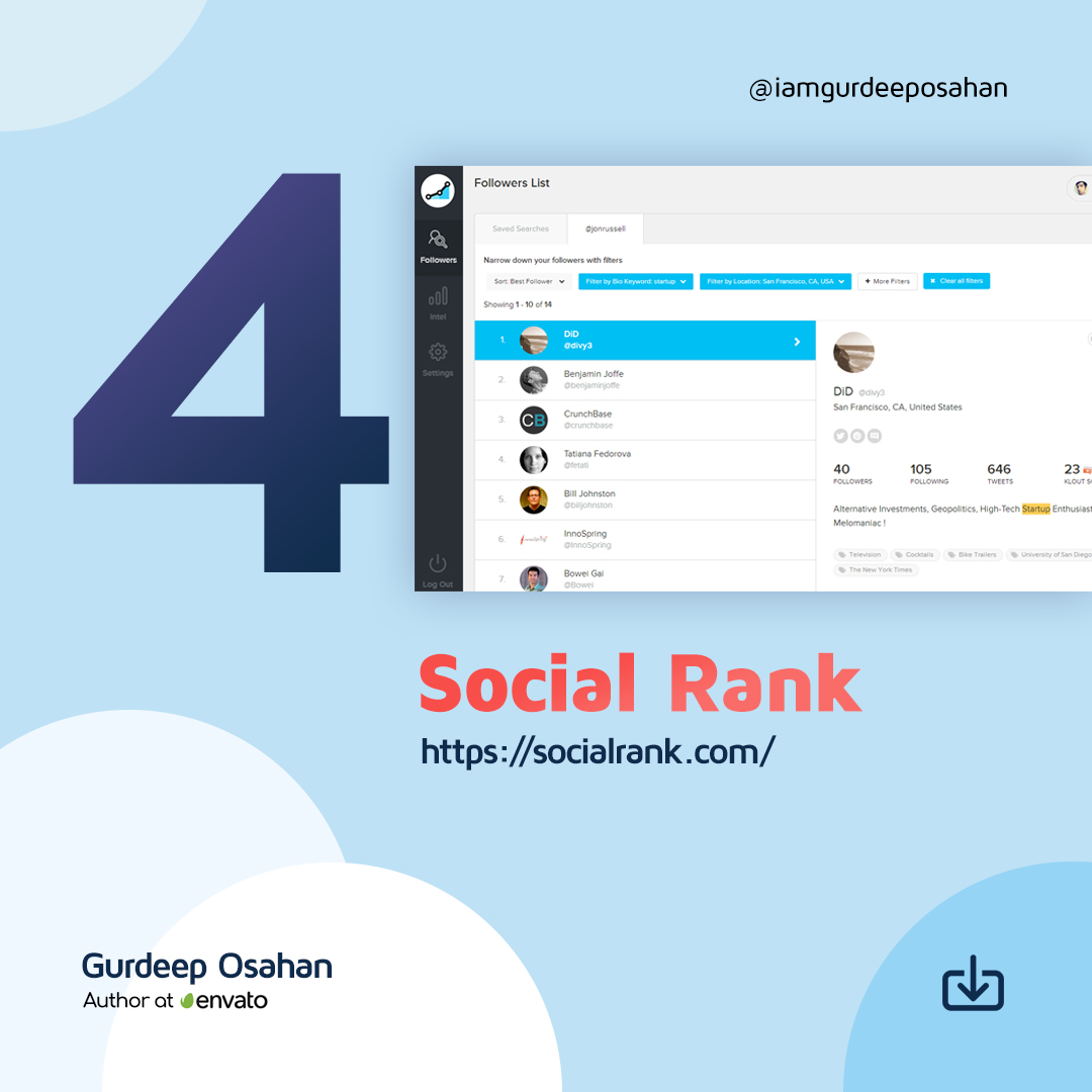
4. Social Rank

6 Tools to Track Your Instagram Followers

You can use SocialRank to discover detailed audience metrics for Instagram, as well as Twitter. You can segment your audience by using various sorting and filtering options. You can create custom lists, export the data to PDF, and run campaigns.

You can sort your audience by Most Valuable (your most influential profiles), Most Engaged (determined by the frequency of engagement), Best Followers (a combination of Most Valuable and Most Engaged), Most Followed, Alphabetized and Chronological (Newest and Oldest). You can also filter and pinpoint your audience by filters ranging from bio keyword, word/hashtag search, and geographic location, to verified number of followers, activity, and more.


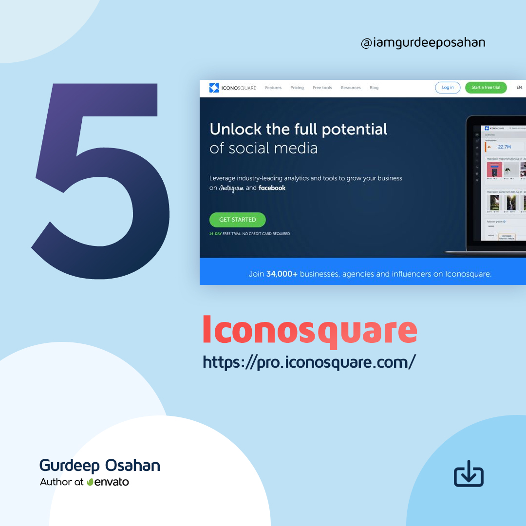
5. Iconosquare

6 Tools to Track Your Instagram Followers

Iconsquare offers both free and paid tools that help you track your Instagram followers. Their free tool provides an Instant Instagram Audit. All you have to do is to connect your Instagram account and enter your email address. They will then send you a free report that tells you where you’re shining and where you’re falling flat. Instagram Audit analyzes 20+ metrics on your latest 30 posts over the last 30 days. It provides tips on your account activity, audience engagement, account settings, and content strategy.

The paid version of Iconsquare offers a robust analytics, management, and scheduling platform for brands and agencies. A customized dashboard quickly visualizes the metrics most important to you, and scheduled reports help you stay on top of your game. Graphs display your performance for metrics like follower evolution, average engagement rate per post, and reach and impressions history. Benchmarks for over 100 industries allow you to compare your performance using metrics like follower growth, engagement, and reach. It includes community analytics, so you can understand where your followers are, the languages they speak, and their age and gender.

A recent addition allows you to understand how your Instagram promoted posts impacted your performance across metrics like reach, engagement, impressions, follower growth, and more.


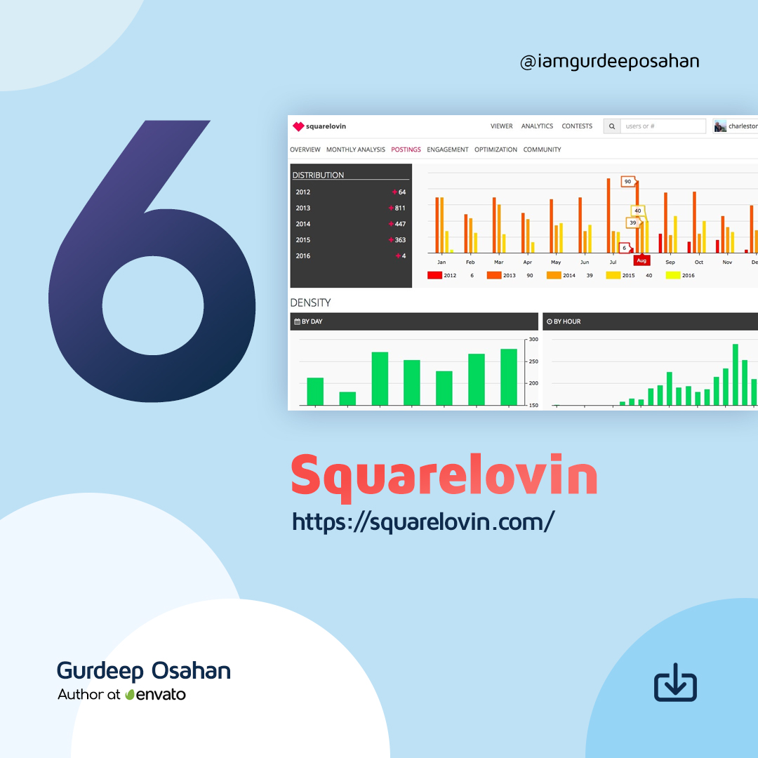
6. Squarelovin

6 Tools to Track Your Instagram Followers

Squarelovin offers a free in-depth analytics tool that gives you access to metrics on your recent posts and growth, a monthly analysis, and a history of your posts broken down into year, month, day, and hour. It provides you with more insights on your communities’ preferences and interests, and what drives engagement. Squarelovin even shows you your best and worst times to post.

6 Tools to Track Your Instagram Followers

IG : Gurdeep Osahan , Ask Bootstrap

Source :  influencermarketinghub  🙂

Posted on — Leave a comment

Designing Website in the Browser (With Google Chrome)

Designing in the Browser

Google Chrome Developers are going to start a video a series in which they will teach the skills to design a website in the Browser. Of course it will be in Google Chrome. We thought we should let you know about it and share it on our website since will be really helpful for new web designers who are just starting their carrier.

Today Google Developers just uploaded an intro for the whole series. In this first intro episode of Designing in the Browser, Una Kravets kicks it off by going over the different topics that will be discussed in the upcoming episodes and what you can expect. Learn different methods and techniques to improve your designs and styling skills as a designer. The full series will start from November 7th, 2019.

Transcript of the Video

UNA KRAVETS: Hi. I’m Una Kravets, and I’m here to tell you about my new show, “Designing in the Browser.” I’m the host, and this is my co-host Disco. In our first season, we’ll be covering web typography, variable fonts, using material design, CSS custom properties, color functions, theming, Houdini, and so much more. Whether you’re a designer looking to have more control over your designs, or a developer looking to improve your styling skills, this show will have something for everyone. Join us on our journey into designing with code. Launching November 7.

Posted on — Leave a comment

Features of Zomato Online Food Order/Delivery App

Osahan Eat - Online Food Ordering Website HTML Template

Zomato is one of the top food delivery and restaurant finder app around the world. Currently, they are providing food delivery service in India, Lebanon and UAE. They spread across as a restaurant finder in 24 countries and available in 10 languages globally.

Zomato has lots of unique features that address customer needs. They provide you with the best app that helps you with dining out, table booking, takeaway and discoveries.

Following are some of the features of Zomato App which I like most.
Table Booking

Table booking is one of the most significant features which is required to build a successful restaurant business. The user can easily book tables whenever they want. Table booking provides convenience to the user as well as prevent disappointment.

Zomato has more than 1.4 million restaurants in their list where you can find a suitable restaurant to book table for your need. Most of the restaurants allow table booking from 2-8 persons.

Scheduling Order

If you wish to order your food in advance, you might want to schedule the time of delivery. This will help you to get your order delivered when you without having to wait for anything. The automated order system processes an order without you having to do anything order than just relax and wait for your order. You can have two type of deliveries either you can pick up your food on your way home or you can have a delivery executive deliver the food for you. You can pay for your food online or in cash to the delivery person.

GPS Live Tracking

The user needs an update every now and then, once the order is placed. The GPS live tracking and the automated system helps in getting the update for the user. The user gets to know if their order is accepted, is in the kitchen, on the way or delivered. The user is able to track the delivery executive and can know his exact location. Also, the user gets an access to the delivery person’s phone number. So, they can get in touch with the person and query about the order delivery. If there is a change of address, it can be communicated through the chat system or through a direct call to the executive.

Follow Your Friends

Everyone loves to eat their favorite food. Zomato provides an option for foodies to follow their friends so that they can know what their friends eat and what they like. They can also discover more from the places nearby.

Self-Pick-Up

You can enjoy offers and promos as well as no need to wait for your delivery. Zomato provides you with a feature that you can order your food online pick it up from the restaurant by yourself. This option saves your time as well as you can have your food on the go.

Restaurant Profile

The restaurant has full control over their profile in the Zomato. They can provide useful information to their user to help them out. The restaurant has the option to provide details like food menu, images, phone number, direction to the restaurant and reviews.

Rating System for Food and Restaurants

A rating system shows your overall progress. The ratings that are provided to certain food order or a restaurant help other audience to judge the food before ordering. The ratings that are provided to the delivery executives help in making the user experience more personal. The delivery executive doesn’t remain just a spot on the GPS map, but is much more involved in the system. The rating system bridges the bond between the on demand food delivery app and the user and the user is provided with enhanced user experience.

Inbuilt Promotional Codes for Discounts

Zomato provide an easy option to apply promotional codes to get discount on the order. These discounts go from 10% to 90%. Coupon Codes are listed on checkout page and can be applied easily with just a click.

Option to give tip to delivery person

Zomato app gives option to give tip to the delivery person. If you are satisfied with the delivery you can give a tip to the person who brought you food.

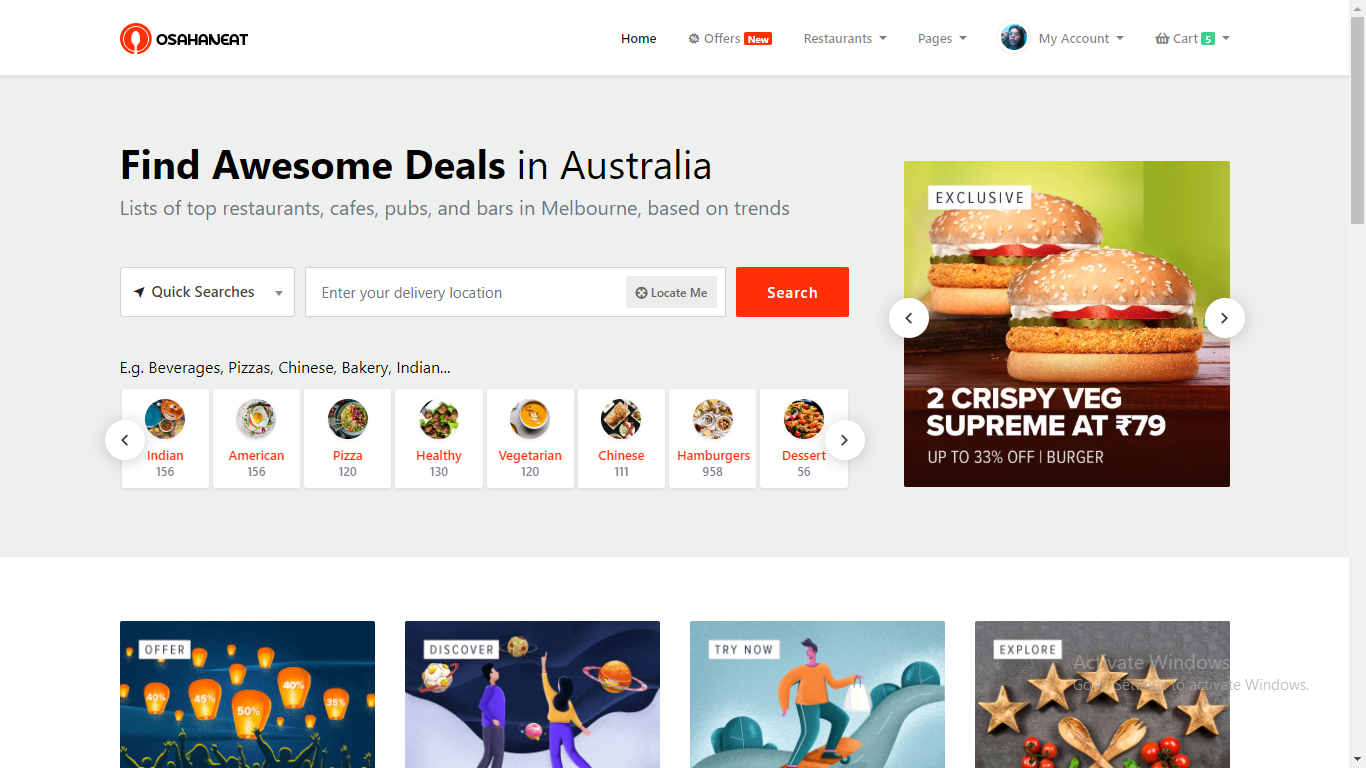
If you want to make a online food ordering website just like Zomato then we suggest you to use the Osahan Eat Website Template. It is responsive template made with Bootstrap. User friendly design & layout. It also has option of react version. This is the best you can get for your new website.

Osahan-Eat-Online-Food-Ordering-Website-HTML

DEMO


Download

Posted on — Leave a comment

UX / UI Design Inspiration

UX / UI Design Inspiration

Where do the Ux & Ui Designers at AJ&Smart find inspiration? What resources and tools do we use to draw inspiration from, and learn new skills? Which designers and websites do we follow to improve our Ux / Ui / skills and knowledge?

Jonathan Courtney, CEO and Product Designer at AJ&Smart curates a TON(NE) of free resources to share some of the most inspiring UX / UI content available on the web!

Where do you find inspiration in the fields of Ux / Ui / Product Design / Digital Design?! Share yours in the comments below!

UX & UI Inspiration ALL LINKS & RESOURCES (In order of appearance)

Product Hunt:
https://www.producthunt.com/

Mobbin.Design:
https://mobbin.design/

Twitter:
Ryan Singer – @rjs
https://twitter.com/rjs?lang=en

Andreas Storm – @st8rmi
https://twitter.com/st8rmi

Matthaeus Krenn – @matthaeus

Aristide Benoist – @AriBenoist
https://twitter.com/AriBenoist

Dribble: Claudio Guglieri
https://dribbble.com/claudioguglieri

Rally
https://dribbble.com/rally

Fantasy
https://dribbble.com/fantasy

Evernote.design
https://www.evernote.design/

Pageflows
https://pageflows.com/

Information is Beautiful
https://informationisbeautiful.net/

Instagram:Tyler Spangler
https://www.instagram.com/tyler_spang…

Twitter

AIGA Eye On Design

TechMeme
https://www.techmeme.com/

Instagram #UXDesign
https://www.instagram.com/explore/tag…

Jon & Jake’s Podcast Product Breakfast Club
iTunes:
https://itunes.apple.com/us/podcast/t…

Spotify: https://open.spotify.com/show/1qvzYYH… on ALL Podcast Apps!

Thumbnail background image – Unsplash – PaweĹ‚ CzerwiĹ„ski
@pawel_czerwinski

Posted on — Leave a comment

UX Design vs UI Design | What’s The Difference? (2019)

UX Design vs UI Design | What's The Difference? (2019)

What’s the difference between UX Design and UI Design? What would you be doing as a UX or UI Designer? In this video, Dee, a senior UX Designer here at AJ&Smart, offers a detailed description of UX and UI design, gives tangible examples for each professions and showcases what you can expect to be doing working in either area!

Posted on — Leave a comment

Gatsby Easily Start with bootstrap

Hello Everyone.

Today We are going to discuss about one of the best framework gatsby’s starter include react-bootstrap. Gatsby is a free and open-source framework based on React that helps developers build blazing-fast websites and apps.

First of all Install Node.js and npm in your system

Gatsby is built with Node.js. To get up and running with Gatsby, you’ll need to have a recent version installed on your computer. you can get it from here: https://nodejs.org/en/download/

To confirm Node.js installation Open up the terminal and Run node --version it will show the currently installed version in your system after that check Run npm --version as the same way.

After successfully installation now time to Install the Gatsby CLI.

Run npm install -g gatsby-cli

Now your system environment ready to develop gatsby website and we are going to get all the source code of gatsby bootstrap stater project. we can directly download from https://github.com/billyjacoby/gatsby-react-bootstrap-starter this link and also if you using git clone this repo by using git clone https://github.com/billyjacoby/gatsby-react-bootstrap-starter.git.

Whenever all the source we get now Run yarn install or yarn. yarn install is used to install all dependencies for a project.

After all done. now Start development server.

Run gatsby develop

Gatsby will start a hot-reloading development environment accessible by default at localhost:8000

Thank you !!

Posted on — Leave a comment

How to display a page in a modal window popup

Jquery

In this post we will tell you about method of using Modal box to display a complete .HTML file in Modal box rather opening it in new window or tab.

There are a few different ways to do this, but the best way is to use an AJAX request to the page using.

Jquery:

$.post("ajax.html", function(data){

    $("#myModalDiv").html(data).fadeIn();

});

Then to bind this to your anchor, assign it an ID and do this in your $(document).ready():

$(document).ready(function(){

    $("a#someId").on("click", function(){

        //Put the code from above here.

    });

});

Note that this will only work for files on the same domain.

If you want to use files on a different domain, you will have to use an iframe.